Back to insights

Online Shopping Optimization

Audio article-

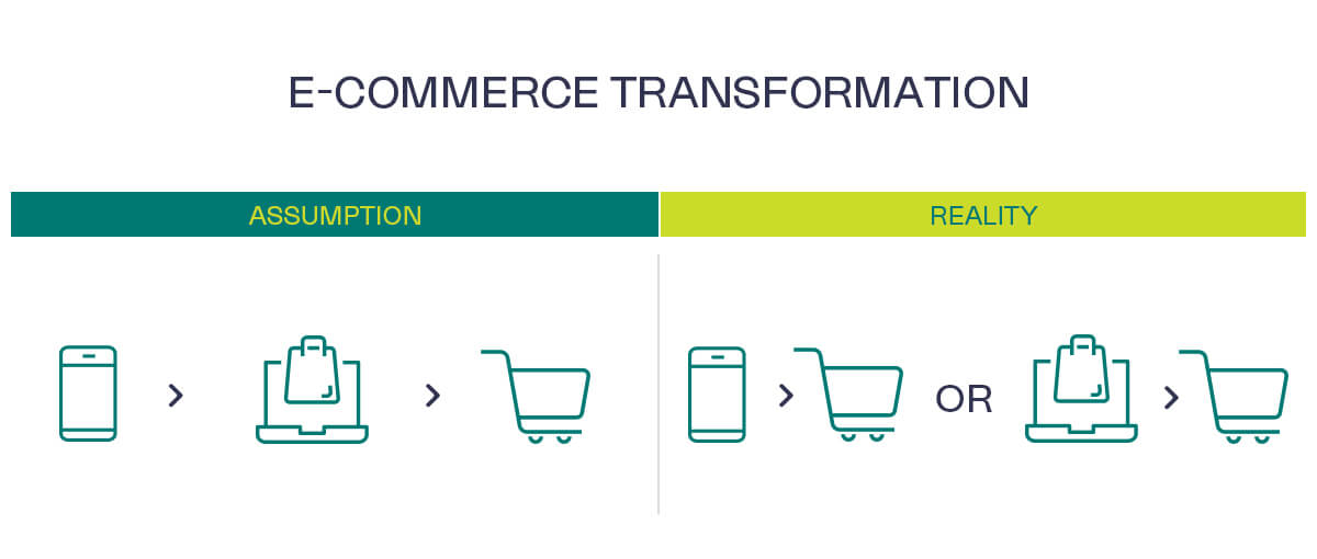
How to increase conversions with a mobile-first strategy for e-commerce?

Mobile, mobile, and mobile – from websites, and various digital assets to online shops, the mobile-first strategy is leading the charge, and the movement is growing.

Even on Black Friday, 40-60% of sales are made with mobile devices (we are mentioning this because you should always be ready for Black Friday, don’t wait until it’s too late).

Google switched to a mobile device index back in 2019 – so even if you were counting on an organic SEO strategy, your mobile web location is what actually matters.

e commerce transformation

In an industry where packshots are the standard, it takes a lot of courage to say that they aren’t the best option and are actually hurting the user experience. Some retailers could accept that and understand that mobile-ready hero images should take the spotlight for mobile devices and that they are a far better solution than packshots. Here’s an example:


Sensodyne packshots comparison

Both visuals use the same amount of space on the mobile screen, but mobile optimized visuals use it better


Optimization is the key

A study from Cambridge followed more than 100 shoppers across all devices, including mobile and tablets. Here’s a short overview:

  • Decreased attention span, narrow visual field, and fast scrolling are just some of the factors why we notice only some details in the visual.
  • Trying to figure out the size of the product on the right picture is hard and requires you to look at the packshot to find the size indicator. Almost every interviewed online shopper had a similar story about buying a wrong-sized product because they relied on the visual of a packshot too much and the information wasn’t visible enough.
  • Noticing formats and product details is problematic on smaller screens.

Shoppers are busy; without any exception, they all said that online shopping is more practical and it saves time. The commonness of mobile devices only encouraged the behavior of fast vertical movement. In the study, the conventional packshot visual on mobile devices failed to successfully communicate the brand, format, variety, and product size even when being the optimal 16mm for mobile devices and 23mm for tablets.

The „Search through fast vertical movement“ behavior is ubiquitous.

Shoppers aren’t particularly good at searching for stuff they need. Most of them completely ignored filter options or filtering of their results, especially regarding the product size. Actually, most shoppers weren’t even aware of what size of the product they bought, and they didn’t know how is their Dove product variant called. They would simply say: „I use the light blue version of Dove“.

Sensodyne packshot

Mobile optimized visual is making the shopping experience easier for the buyer


On mobile devices, shoppers use the so-called „Vegas style“ of vertical movement through their shop results.

Vegas style movement is the fast vertical movement of the screen from bottom up, and then stopping the movement when the shopper sees what they want. Packshots do poorly in that environment leading to low conversion rates and problems for us and other retailers.

According to that, it is important to optimize the content to fit the new environment and buyer habits.